My Part
My Part
I created the User Interface of the Website in "Figma";
And the images used were created using Ai generation with Trial and errors by Prompting, It hardly took a day or so and after many prototypes This Interface was Selected .
And the images used were created using Ai generation with Trial and errors by Prompting, It hardly took a day or so and after many prototypes This Interface was Selected .
I created the User Interface of the Website in "Figma"; And the images used were created using Ai generation with Trial and errors by Prompting, It hardly took a day or so and after many prototypes This Interface was Selected .
Overview
Overview
Mine Project of my Second year in Engineering.
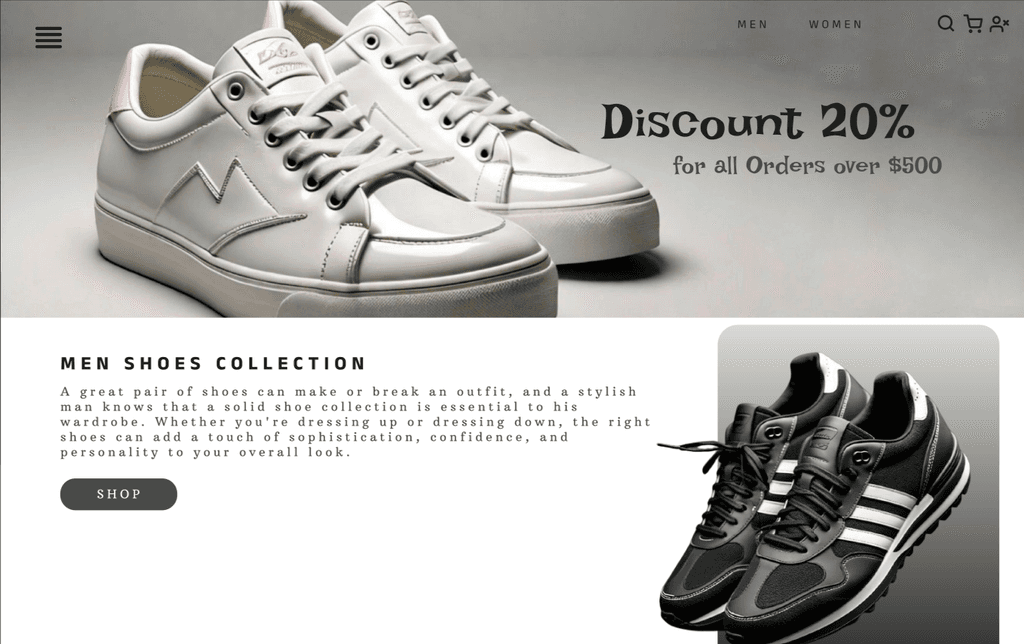
This was a Website where one can shop Warbles like
Clothes and Shoes , categorized in Section of Men and Women.
Mine Project of my Second year in Engineering.
This was a Website where one can shop Warbles like Clothes and Shoes , categorized in Section of Men and Women.
Design Process :
Design Process :
Creating User Flows: I mapped out user journeys for common tasks like:
Browsing products by category or gender
Viewing product details
Adding products to cart
Completing purchase
Designing Wireframes: I sketched out low-fidelity wireframes to structure the website layout and information hierarchy.
Iterative Prototyping: I created high-fidelity prototypes using Figma to test and refine the design based on user feedback.
Visual Design: I applied a minimalist aesthetic with clean typography and high-quality product images, ensuring the focus remains on the products. I incorporated elements like a discount banner and product highlights to enhance the browsing experience.
Understanding User Needs: Through user research (e.g., surveys, reviews), I identified key user needs such as:
Easy navigation and product search
Clear product information (size, color, price)
Secure and seamless checkout process
Inspiring and visually appealing product presentations.
Key Design Features:
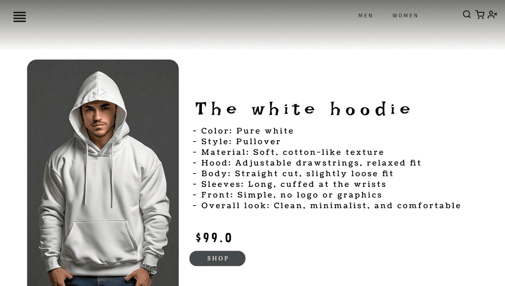
Visually Appealing Product Display: Product images are prominently displayed with concise details, allowing users to quickly assess their interest.
Detailed Product Pages: Detailed product information, including size charts, material specifications, and customer reviews, helps users make informed decisions.
Seamless Checkout: A straightforward checkout process with secure payment options and clear order tracking functionality.
Mobile-First Approach: Designed for optimal user experience across all devices, ensuring responsiveness and seamless browsing on smartphones and tablets.
Intuitive Navigation: Clear menu bar with categories and gender filters for easy product discovery.
Lessons Learned:
Visual Storytelling: High-quality product images and engaging content create a compelling narrative that influences purchasing decisions.
Mobile-First Design: In today's mobile-first world, prioritizing mobile-friendly design is essential for reaching a broader audience.
Iterative Design: Continuous testing and feedback are crucial for refining the design and ensuring a user-friendly experience.